More Data, More Problems
Beer, like any worthwhile topic, may be approached from various angles and on different levels. In this series we have focused on individual beer styles, looking at their characteristics and how they relate to each other. We reviewed the recommendation from one style to another and divized different approaches for making sense of this: link & node, longest path, and PageRank. In our current piece we are going to step back and look at the style categories, cutting down on the nearly 80 styles to just over a dozen elements, lessening the cognitive load and allowing us to appreciate the landscape at a different scale.
These families of beer styles have been with us all throughout our journey. In the beginning we used them to determine summary characteristics for ABV, IBU, and SRM, and later we leveraged this grouping when creating the (Les Mis) grid. While the recommendations were somewhat scant in the latter instance we made the vis more robust by coloring like-category beers in the grid and encouraging exploration within categories, in addition to the direct recommendations supplied in the data (data is not always complete to our needs, sometimes it is overly complete; a theme to return to). Lastly, even when the categories were not called out explicitly, the use of color coding was used to (when possible) identify beer styles of the same family. A gentle reminder of connections inherent in beers.
Wanting More from Less
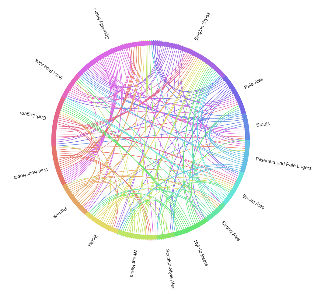
Much as the categories were carried through, even in pieces where they were not highlighted, we will leverage style information to help inform our current representation. By leveraging beer style links/recommendations we are able to develop a visualization that aggregates connections among categories, and stick with this coarser detail. By abstracting away the more particular associations for a higher level consideration we are loosening the recommendation criteria (yet again). Instead of a prescription or recipe this is a guideline, a general way of thinking about beer styles in relation to one another. Rather than bogging the viewer down with what appear to be countless relationships, which become as unwieldy in the mind as they do in the “hairball” link and node graph (link) we now have a more simple and general way of considering the relationships. Moreover, we see what many of us thought to be the case, as long as you continue exploring the beerscape you will visit all of the categories. In returning back to where you started, having a circle play a part in the visualization is only fitting.

Data Source: CraftBeer.com
Beer drinking and exploration is circular and circuitous but that does not necessarily mean it is repetitive (your friends’ tired conversations notwithstanding). Each go-round provides an opportunity to employ a new perspective. The flash and punch of an IPA may grab you at first but with more experience you may begin to appreciate the more nuanced, muted, and balanced brews of other styles, other kinds of IPA’s included. The chord chart serves as a gentle guide to bouncing from one style to another.
Half Map, Twice as Accessible
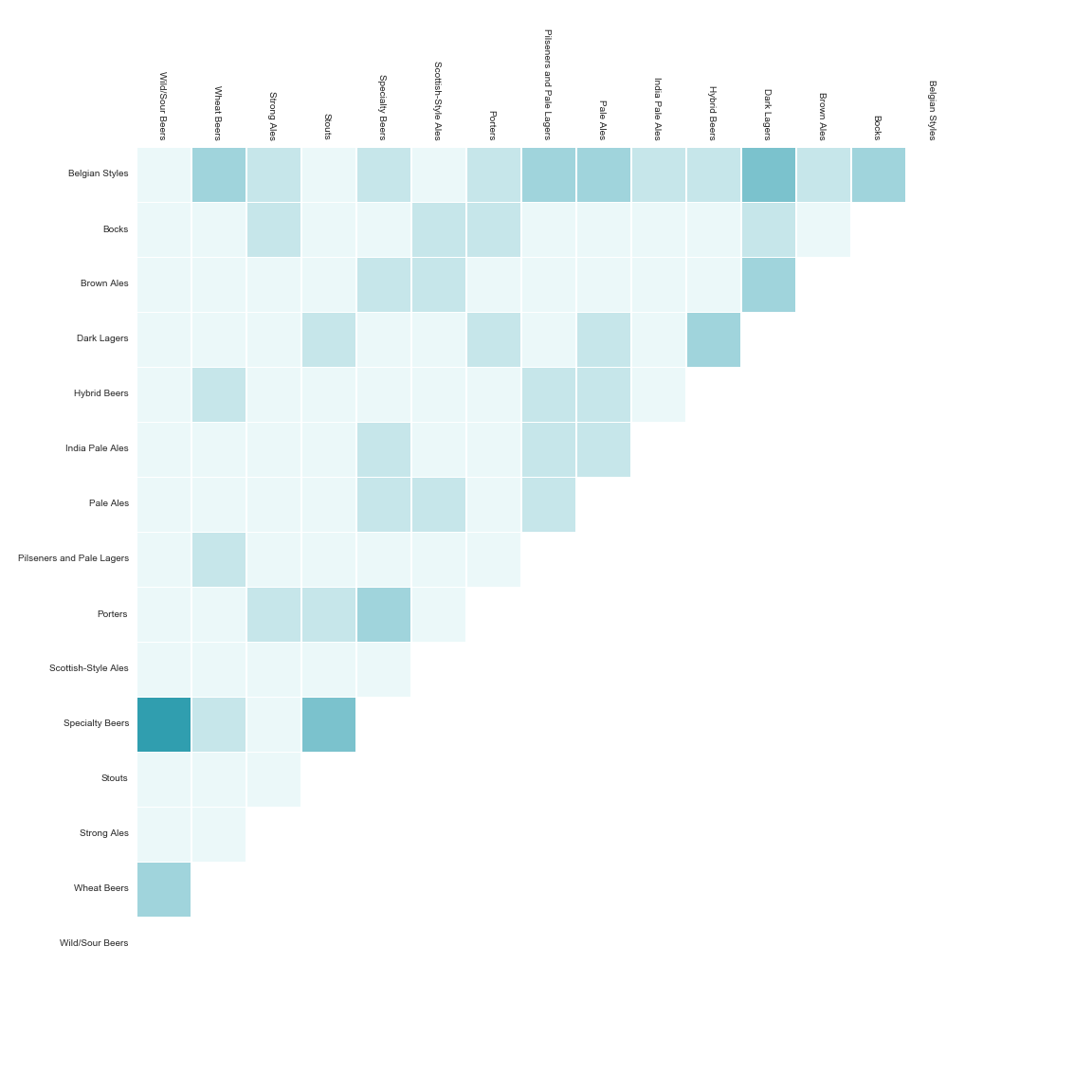
Collapsing our 70+ styles into 15 categories has not automatically made the data vis more user friendly. Naturally, this is a factor of the underlying data and vis idiom chosen, both. If we may take anything away from the chord chart it is that things are intertwined and overlapping (back to the circuitous nature of the exploratory endeavor). The eye cannot help but jump around the connecting threads and different colors. This is beneficial from the perspective of inviting further investigation but it also makes it difficult to focus on specific relationships for any length of time, tiring the eyes… Many times the connections that go across several categories become obscured by other category pairings.
Changing the representation to a 15x15 grid, with matching category names across both axes, having boxes represent the meeting of two categories, the color saturation determined by the strength/number of underlying connections (the 70+ styles, again)…

Data Source: CraftBeer.com
This is one of several posts that have prompted me to approach future explorations with a different motivation, one that is more heuristic driven. 1 Of course one could play with the charts more and improve them on several criteria but ultimately what fun is there in consulting a table or graph when the information might be condensed into a few memorable and accessible guidelines?
Notes
1 Rules of thumb allow us to be as simple as possible in our approach, but no simpler. The aggregation of data will inform our skeletal representation/guidelines in jumping from one beer style to another, with a reasonable expectation of making a smooth transition more often than not. By its very nature any heuristic will not cover all situations and as a result will mislead on occasion. However, we are trading exhaustiveness in for robustness. Beer styles will continue to develop and be out right invented. Identifying general through lines that connect styles will help make approaching them more likely to succeed. This can be thought of as the machine learning model trade off: variance versus bias. If your model is overly accurate as a result of matching the training data, i.e. memorization, you have a better chance than not of performing poorly on new, unseen data. On the other hand, a model that is too strict/limited will provide overly simplistic predictions; think a straight line regardless of data points. The key is to find a balance between the two so that the model generalizes well to unseen data. Moreover, there is the consideration of processing cost. The human mind is especially limited in this capacity when it comes to holding new information in working memory. Until a new skill is practiced sufficiently to become ingrained and second nature we would do well to keep just a handful of useful things in mind that allow us to move in the generally desired direction. ↩