Experts Know Things, Right?
What we hope to discover in this season-long investigation into American football game predictions is which major outlet has the best brain trust. By major outlet we mean the networks that carry the games, CBS, ESPN, FOX and NBC,1 and best, at least initially, will be determined by how well the respective crews, as a collective, do against game results. Game results should be self explanatory and in addition we will be looking at performance against the spread (using SportsLine), where applicable. What exactly “as a collective” means is simple enough to guess at but will be explained further below after introducing the prediction sources and explaining a bit about the data sets.
To begin with we have two human panels, CBS and ESPN, and two data models/simulations, FiveThirtyEight and FOX. CBS offers straight up (SUP) and against the spread (ATS) picks, ESPN only SUP. CBS and ESPN have 8- and 9-men2 expert crews, respectively. We will be tracking all of the picks on an individual (each expert’s choice) and collective level, taking each expert’s pick as a vote for that game. Regarding the latter voting process, we will be using the percentage of votes for a specific team as a proxy for that panel’s expected winning probability. Due to CBS having an even number of experts, introducing the very likely scenario of 50/50 splits, we will give the push to the away team in SUP and to the betting dog in ATS. The CBS split decisions of 50/50 will not be a problem in determining forecast probabilistic accuracy as we will be using the Brier score (BS) and this method takes this eventuality into consideration.
Both FiveThirtyEight and FOX provide their predictions as a probability. FiveThirtyEight relies on ELO ratings and besides winning expectations also provides ELO based point spreads (how this part will be analyzed will be made clear after week 3). FOX is partnered with WhatIfSports.com and I am looking to get more information on their methodoloy but it is stated that the winning percentages and average scores are based on 501 game simulations. Both data models/simulations, FiveThirtyEight and FOX, released their predictions for the entire season ahead of any live snaps and will be updated throughout the season. I intend to track the performances of both the pre-released data picks (referred to here as “a priori”) and those updated on a week-to-week basis (referred to as “in situ”).
Perhaps you’re already seeing how much of this will play out based on what’s been described above. The probabilities for each of the 4 initial sources will be compared to actual game results to determine the effectiveness of the predictions. Should you not have bothered to click on the Brier score link above let us summarize it by saying that a) the more confident the predictions, the greater the reward/penalty based on outcome, & b) the lower the BS (Brier score or bullshit, you decide) the better. There will be 8 anticipated predictive performances to track (this is expected to grow, stay tuned):
- CBS SUP
- CBS ATS
- ESPN SUP
- FiveThirtyEight “a priori”
- FiveThirtyEight “in situ”
- FOX “a priori”
- FOX “in situ”
- Random probability prediction
We are interested in a number of anticipated comparisons (expert panel v. expert panel, humans v. algorithms, algo v. algo, and of course all against the random predictor which we suspect coming in last but is presented here as a sort of baseline) and expect others to come to the fore as the season proceeds. Chart, tables, and occasional interactive visualizations will be made available on a weekly basis (Wednesdays) for the duration of the season. Each week will provide an opportunity to look at the football season and predictions in a new light.
Week 17 - The End of a Bumpy Road
Share Week 17
After four short months we conclude this piece with a final overview of how the season played out for our respective sources. I will focus on the straight up (SUP) picks since this includes all sources.12 First up are the win totals for the season followed by a bump chart showing weekly and cumulative rankings for the season.
Only on a few (fluke?) occasions was the random game picker not in last place. This could have been expected by intuition (there’s obvious information in game match-ups) or gleaned from the week 11 above/below .500 graph. When it came to the SUP comparisons we saw a clear split between the actual game sources and the “coin flip”.
| Source | Season Wins | 1st Place (weekly) |
|---|---|---|
| FiveThirtyEight (in situ) | 161 | 7 |
| ESPN (regularized) | 160 | 5 |
| CBS (regularized) | 157 | 7 |
| FOX (in situ) | 157 | 4 |
| RANDOM | 117 | 1 |
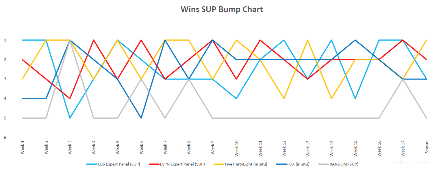
Data Source: CBS, ESPN, FiveThirtyEight & FOX
Of course we could not possibly sign off without one final mention of the Brier score (BS). Full season numbers and positioning again in table format followed by a similar bump chart to catalog the season’s progress.
| Source | Season Brier Score | 1st Place (weekly) |
|---|---|---|
| FiveThirtyEight (in situ) | 0.221 | 8 |
| FOX (in situ) | 0.233 | 3 |
| ESPN (regularized) | 0.246 | 2 |
| CBS (regularized) | 0.253 | 4 |
| RANDOM | 0.360 | 0 |
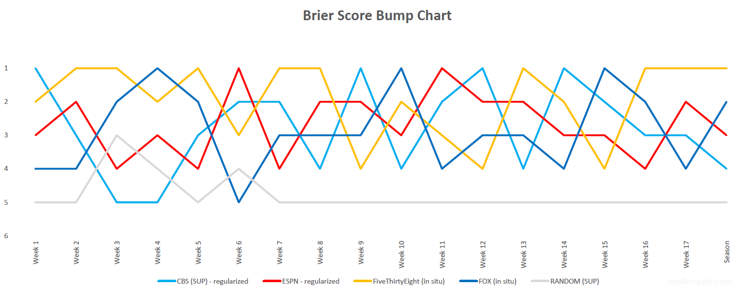
Data Source: CBS, ESPN, FiveThirtyEight & FOX
All in all FiveThirtyEight held tough and proved the most trusted source of game picks on a number of different metrics. It was close all the way through, however.
Any big surprises? Tough to say after 17 weeks of being submerged in the process. While it may take some time to fully appreciate what to make of all this I fully acknowledge how difficult the picking of games is. This was especially underscored by no one model running away with the season. There were moments when that looked like it would happen but as far as this season playing out the breakout never occurred.
A quick look at ATS, where the random model did considerably better (with a wrinkle).
| Source | W-L-D | win% | ATS BS |
|---|---|---|---|
| CBS | 128-120-8 | .5 | 0.302 |
| FOX | 119-122-8, no pick: 18 | .478 | n/a, week 6 arbitrage |
| 538 | 114-118-8, no pick: 28 | .475 | n/a, week 6 arbitrage |
| RAN | 121-127-8 | .473 | 0.337 |
Though the random selection of ATS games turned out more correct picks than either FiveThirtyEight or FOX, it did so at a lower percentage. This was due to spreads sometimes matching those estimated by FiveThirtyEight and/or FOX, resulting in “no picks” on those occassions for those sources. As a result the random choices turned up both more wins and more loses.
Going back to fully appreciating what this entire effort has meant, I think it is safe to say that the findings are full or wrinkles, like I just said, and nuances. I will be updating all of the below graphs over the coming weeks with full season numbers, some new commentary, and additional charts as a PDF document (sign up if you’re interested).
Week 16 - Arrows Abound
Share Week 16
It is not clear if my coverage over the past several months has come across as dismissive or condescending of the game predictions. Believe me that has not been my motivation or purpose. The times I do bring up less than spectacular performance is more meant to highlight the difficulty of the task rather than heap any disparagement on the sources. Am I getting defensive? No, not really, but I think it’s worthwhile re-calibrating every once in a while, even at this late stage.
With respect to being late in the season I thought it was worth looking back at what some of the preseason expectations were and how the season played out as a comparison. This recap will hearken back to week two when we highlighted the average expected win totals for teams by both FiveThirtyEight and FOX (the only two where we could take such a long term view).
In case you can’t be bothered to remember or click back… Even with one more week of games looming we can get a general idea of the difference between expectations and reality.
![]()
Data Source: FiveThirtyEight
I’ve taken the expected win totals, rounded to whole games, identified the difference between this number and win totals through week 16 (giving half a game to ties). Again, this throws off the final analysis by a game but the visuals below still get across the point. The difference is in actual wins versus expectations, with differences sorted by biggest positive results at the top, trickling down until we get to the biggest duds against expectations.
![]()
Data Source: FOX
To help some of these graphs I have calculated root mean squared error (RMSE) different for each. This one number score, FiveThirtyEight (3.03) and FOX (2.93), helps provide a quick comparison.
There are a few strands that we can follow from here. First and foremost we see which data modeling source had the most accurate expectations overall. From here we can look at the changes in game predictions. FOX for instance switched its choices of winning team more often than FiveThirtyEight. Naturally we can then look at the winning performance of those changed game picks (week five). Lastly, we see what the overall win-total and Brier scores are, not just for the data models but also bringing in the human expert panels (next week). It’s all coming together now.
Week 15 - It’s the ROC!
Share Week 15
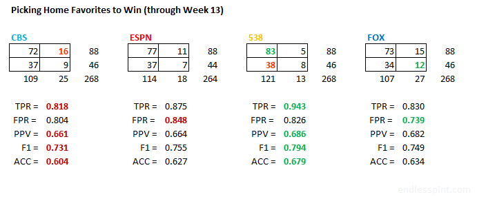
Didn’t mean to beat you over the head with all of those confusion matrices back in week 13. I’m referring to the true positives, false positives, etc. of the home/favorite picks. Now, I don’t regret bringing it up mind you but I realize I may have left you hanging, which was partly by design. Whether you were confused (pun’d!) or wanted more the following is meant to resolve either situation.
To better summarize the performance of our game classifiers we will use a variation on the ROC curve. Here a classifier’s performance is determined by mapping it’s true positive rate against its false positive rate. A 45° line is drawn from the bottom left to the upper right hand corner as a guide. This line represents a random classifier, a.k.a. a coin flip. If your classifier does not get above this threshold you’re in trouble. A quick look at the confusion matrices I mentioned earlier shows that each of the pick sources avoided the ignominy of falling below this threshold. At least up until then they had.
Those week 13 numbers were an aggregate up to that point in the season however. Breaking out the picks into weekly performance provides a more mixed picture. More than a few times we see our experts and models under performing.
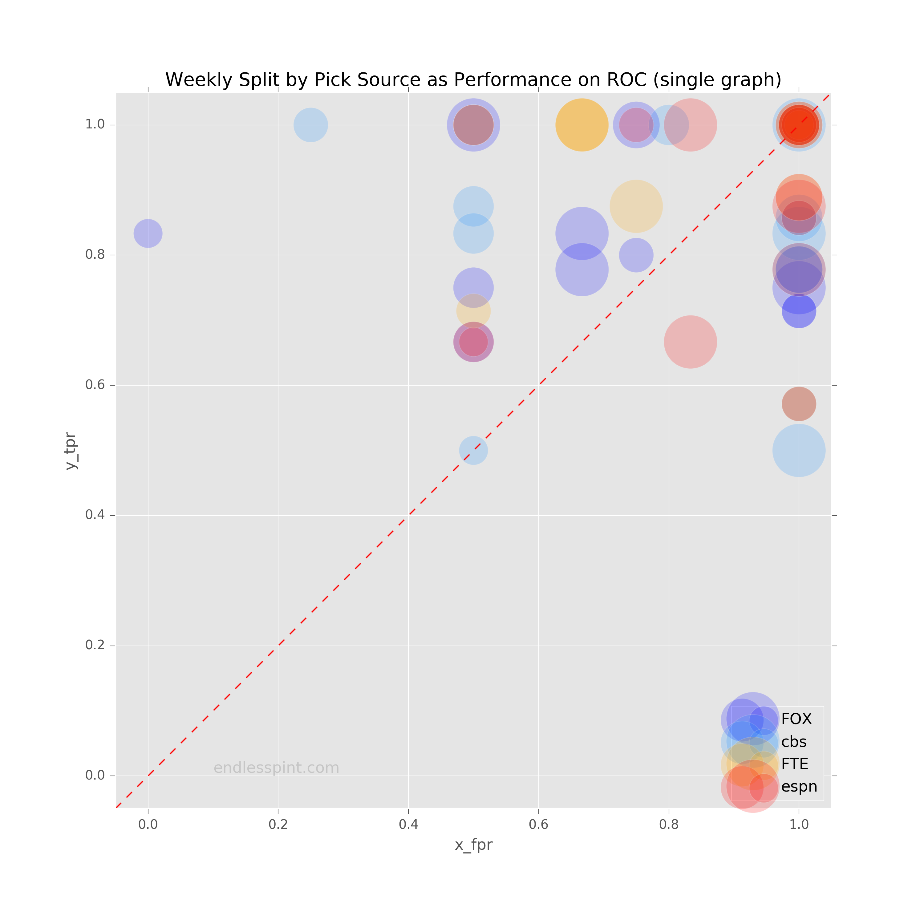
Data Source: CBS, ESPN, FiveThirtyEight & FOX
The above is a little busy so we will split apart the sources into their own separate subplots. That’s better. Now we more clearly see the weekly dots, with sizes representing the number of games predicted when a home favorite was in play.
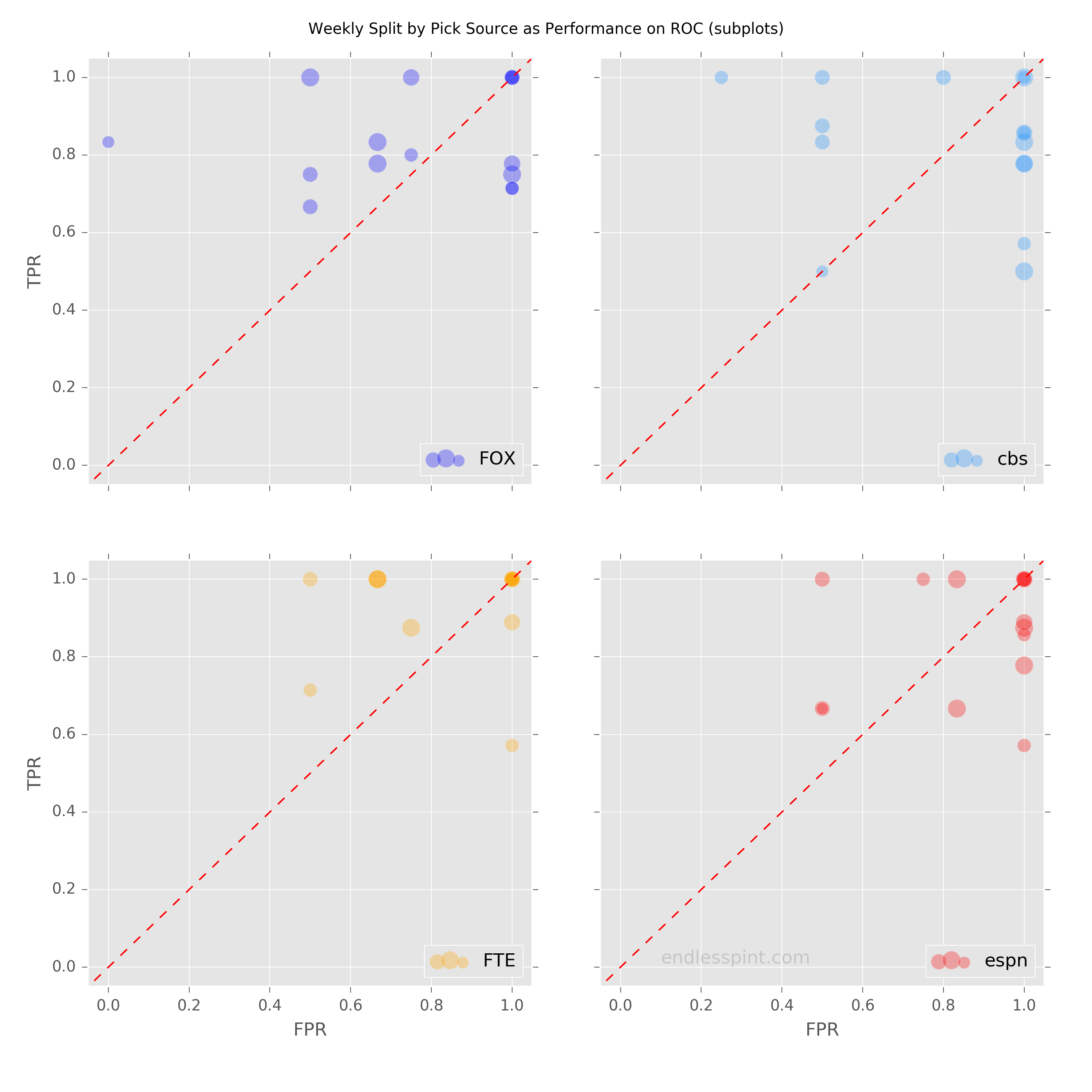
Data Source: CBS, ESPN, FiveThirtyEight & FOX
The above charts contain the performance through the latest week, in which we saw both human expert panels dip just below the 45° line (random pick performance).
Updated Sensitivity (TPR) and Specificity (FPR) through week 15
| TPR | FPR | |
|---|---|---|
| cbs | 0.824 | 0.827 |
| espn | 0.863 | 0.865 |
| 538 | 0.931 | 0.827 |
| fox | 0.833 | 0.750 |
There is an additional tool available to help measure this sort of performance still further. Different subject areas will require different considerations of what makes an effective classifier. For example, tracking fraudulent credit charges typically allows for fewer false positives then a medical screen. Regardless of the subject area however, when dealing with the same classification task, in our case correctly picking football games, you may leverage the use of one number to compare competing classifiers: the area under the curve, (AUC).
Basically, the larger the shaded region under the line the better.
Using the most recent TPR and FPR rates I plotted this area for each game prediction source. Below are the less than pretty results.
Data Source: CBS, ESPN, FiveThirtyEight & FOX
Ouch! Consider that if one had simply chosen all home favorites (154) to win (102 did in fact win), adding no discriminatory sophistication, the resulting TPR and FPR would be 1.0 each (landing on the top right corner of the plot). The AUC for such a scenario would be .500.
Week 14 - Slippery Slope
Share Week 14
At the start of this process I wasn't sure how well the Brier score (BS) measure would resonate, with myself included. I've done my best to bring it up, occasionally highlighting it, but also attempting to not beat the reader over the head with it.  In some respects the weekly visuals are an effort to make BS a more intuitive yardstick.
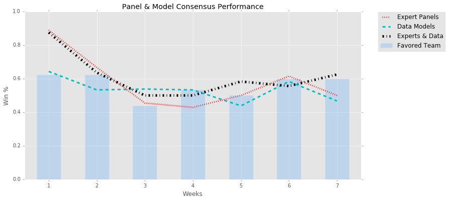
A couple of weeks back I thought I may have hit upon an approach that drove home the point (without even specifying the metric). This was back in week 10 where I provided a throwaway graph in the form of a bubble chart, plotting the confidence percentage by source against the actual winning percentages. What that chart meant to show, in a simple though occasionally busy and cluttered way, was the general reliability of the sources or lack there of. Simply by identifying the color of the bubble (source), it's size (number of said predictions), and placement above or below the 45° line (beating or missing expectations, respectively) the user could see who was the most reliably trustworthy.
This week I apply the same motivation with updated data to present this takeaway once more. Instead of dots or bubbles I implemented lines in a slope graph. The left hand position of the plot represents the percentage confidence of the prognosticating sources. On the right side we have the resulting winning percentages. Line colors represent the sources, thickness the game counts, and the slope of the line, whether upwards or down, how far off the sources are from their intended outcome. A flat horizontal line would signify expectations matching results. An upward moving line from left to right would indicate beaten expectations while a downward slanting line the opposite.
A few things of note. The human panel sources have fewer, thicker, and downward sloping lines. The fewer and thicker aspect go hand-in-hand as the human panels have a set number of experts, resulting in a reliably repetitive set of possible confidence percentages week-to-week. The data models being more "fine-tuned" provide something closer to a continuous range of confidence percentages, resulting in many more and thinner lines. While it is not possible for us to break out the human panel picks into more fine-level percentages, which might allow us to see some upward moving lines, we are able to bucket the data model picks. Grouping the data model confidence percentages will allow us to more reliably compare the computers versus humans and see how well they perform against one another.
Having bucketed the FiveThirtyEight and FOX picks into five groupings each we are better able to read the new graph. Much of the clutter is gone. Additionally, and unexpectadely, we see a lone upward sloping CBS line that was previously obscured (this is a unique conf % due to one of the panelists withholding a vote on one game). Instead of data model lines going all over the place we see a more stable view. Many of the distracting upward lines that seemed to suggest the data models were routinely outperforming their expectations now appear to be overstated impressions. It would appear that the data models are not far off in their accuracy from their human expert counterparts, though perhaps a little less carried away with their picks. While there are some very thin upward sloping lines and a few gradually depressed ones, overall the data model trends look more flat than the expert panels of CBS and ESPN.
Data Source: CBS, ESPN, FiveThirtyEight & FOX
Something glossed over and assumed, in both the original bubble chart and these slope graphs, is that we want “better” performing results than the expected confidence. But is that correct? Wouldn’t a dot above the 45° line or an upward line, if either were far enough off from the stated percentage, indicate a problem in prediction just as well as if they were in the opposite direction? Of course they would. Being aware a game predictor is habitually optimistic or pessimistic is a good gauge in knowing how to hedge but it does not specify by how off the predictor is.
Running a simple RMSE calculation on the above we find that when grouping the data models into buckets (and CBS’ lone odd game) they have the lowest errors among the four sources.
| source | bucket RMSE | orig vis RMSE |
|---|---|---|
| CBS | 0.181 | 0.181 |
| ESPN | 0.166 | 0.167 |
| FiveThirtyEight | 0.042 | 0.191 |
| FOX | 0.083 | 0.213 |
However, when we stick to the original visualization’s underlying data we see that the human panels do better, their naturally aggregating probabilities ironing out much of the variation in game outcome (think of all those 90% confidence choices that were outright duds). What happens if we analyze source performance by game? Well, then we’re basically talking about the Brier score11 and as we approach the end of the season we will certainly be highlighting this metric one more time to drive home the point of game picking reliability.
Week 13 - Total Recall
Share Week 13
This week I wanted to look at where the correct SUP picks were being made. Would there be big discrepencies or different mixes among the sources? I split the picks between two different criteria: favorite/dog and home/road. I wanted to know what number of correct picks fell into the four resulting catetgories: home-fav; home-dog; road-fav; road-dog. Each of these four segments would apply to our four sources, resulting in 16 potential buckets baring zero counts (FOX has to date zero home-dog correct picks out of five such calls).
One of the inspirations for this breakdown was the Bokeh donut graph example. In that instance the underlying data was from the Olympics and the presentation was a slicing of country medals by Gold, Silver, and Bronze. I flirted with using the sample code from the gallery but was unhappy with the color scheme and inability to nest home/road ontop of fav/dog, ultimately deciding it was not worth the bother. I did not want to make two graphs when I could get away with the one (no disrespect to Contact)?
Data Source: CBS, ESPN, FiveThirtyEight & FOX
The results were not immediately surprising but they did raise some further questions which is sometimes better than a quick conclusion. As might be expected the majority of correct picks came from choosing the favorite. A majority of these correct picks were of home favorites, again no big deal. What was a bit curious was the breakdown of dog picks. For each pick source the majority of correct dog picks were of road teams. What constitutes a favorite? The betting line. This begs the question, how much of a dog were these dogs? We’ll get to that but first a closer look at home-favorite performance by source via confusion matrices.
Data Source: CBS, ESPN, FiveThirtyEight & FOX
What at first looks like similar performances in the first graph are sliced into clearer detail above. The boxes are divided into True Positive (TP), False Positive (FP), False Negative (FN), and True Negative (TN) and are layed out as shown in the table below:
| TP | FN |
| FP | TN |
What we see is consistent with the underlying trends to date. The data models are slightly better. The human panels are slightly more error prone.
What’s the correct/winning Road Dog avg line? There have been 46 road dog wins through week 13. The average line… home team favored by 3.86 points.
Week 12 - Who’s Got the Best BS?
Share Week 12
Time to check in on one of the primary predictive metrics, the Brier Score (BS). This was an excellent opportunity to use yet another visualization idiom. Perhaps it’s a bit of overkill but I wanted needed to get it out of my system. This week I show a streamgraph to represent the week over week BS for each of our sources regarding SUP picks.
For the human expert panels I used the regularized rating and the data models charted are (naturally) for in-season picks.
Data Source: CBS, ESPN, FiveThirtyEight & FOX
The visualization leaves something to be desired. For learning purposes this is a good thing. Let us count the ways in which the graph could provide the data more effectively.
First, the difference in non-Random BS is quite small week to week. As such, a chart that uses area to represent divergence may not be the best way to get the difference across, especially when the stacking of these areas/streams makes the point of reference more difficult to ascertain. Second, by moving the Random stream to the bottom, which is consistently the largest, I may have lost out on the aesthetic if not the practical use of this sort of graph.
Third, what at first looks like a helpful attribute in the form of hover tools turns out to leave something to be desired. The hover tool indicates the stream source and y-coordinate. What it should have shown is the BS for that source/week. The user can still identify the BS but only by finding the difference in y-coordinates between sources. This is asking too much of the user and defeats the purpose of making the data easier to “read” than via a table.
We can still answer who generally has the best BS but beforehand I wish to volunteer my execution of this graphic as being the biggest BS of the bunch. Having cleared my conscience I can get back to the task at hand.
Best BS means smallest BS so we’re looking for the tightest stream. Right away Random can be tossed out, followed by the occasionally pregnant looking CBS (light blue) and ESPN (red) lines. That leaves us with the two data models, FiveThirtyEight and FOX. Hmmm. I’m gonna call it a tie. Too close to call.
What have we learned? I’m lazy (efficient?), have no shame, and for specific comparisons a streamgraph may not be the best tool. Instead, it would appear wise to leverage a streamgraph for getting a general picture of trends (on larger data, no less, to make it worthwhile).
Week 11 - Breaking Even, Breaking Bad
Share Week 11
The last chart of last week used a diagonal line to help provide guidance on which level of confidence predictions were performing above or below expectations. In the description of that graph I mentioned performing at or above .500, breaking even with picks.
This week we will remove the hints and speak directly to performance above .500. Just to be clear I am counting the difference between correct picks (“wins”) and incorrect picks (“loses”) as the number above/below .500. There seems to be some debate out there on how to count this depending on what you want to measure. I’ve said my piece, I’m moving on.
First up is the SUP performance where we are able to see all pick sources as well as the random picker. Predictably the latter is a dud. The actual professionals are all above .500 through week 11 and have been since the very beginning. There has been some jockeying at the top, especially early on, but over the long term FiveThirtyEight has shown itself to be most consistent. CBS started out strong, stumbled, has been in every position (1st, 2nd, etc.), and is now trailing behind though it is in a upswing. Unfortunately the recent upswing is shared by all of the other pick sources and as a result CBS has made up no ground.
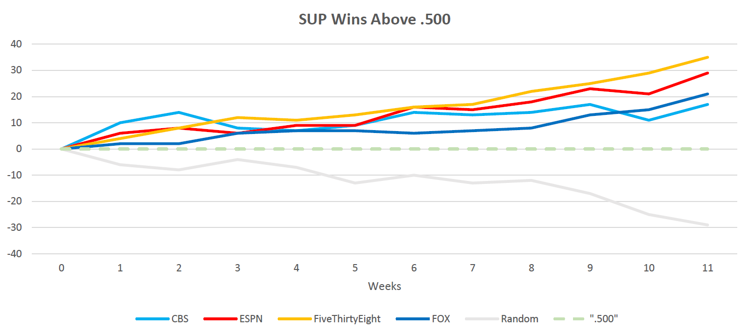
Data Source: CBS, ESPN, FiveThirtyEight & FOX
Our next chart shows a less rosy picture. One thing is consistent and that is FiveThirtyEight once again coming out on top. Damn that ELO is a good way to make predictions. CBS is again not showing well, even falling below the random generator in performance. Meanwhile, Fox is dancing around the breakeven .500 line.
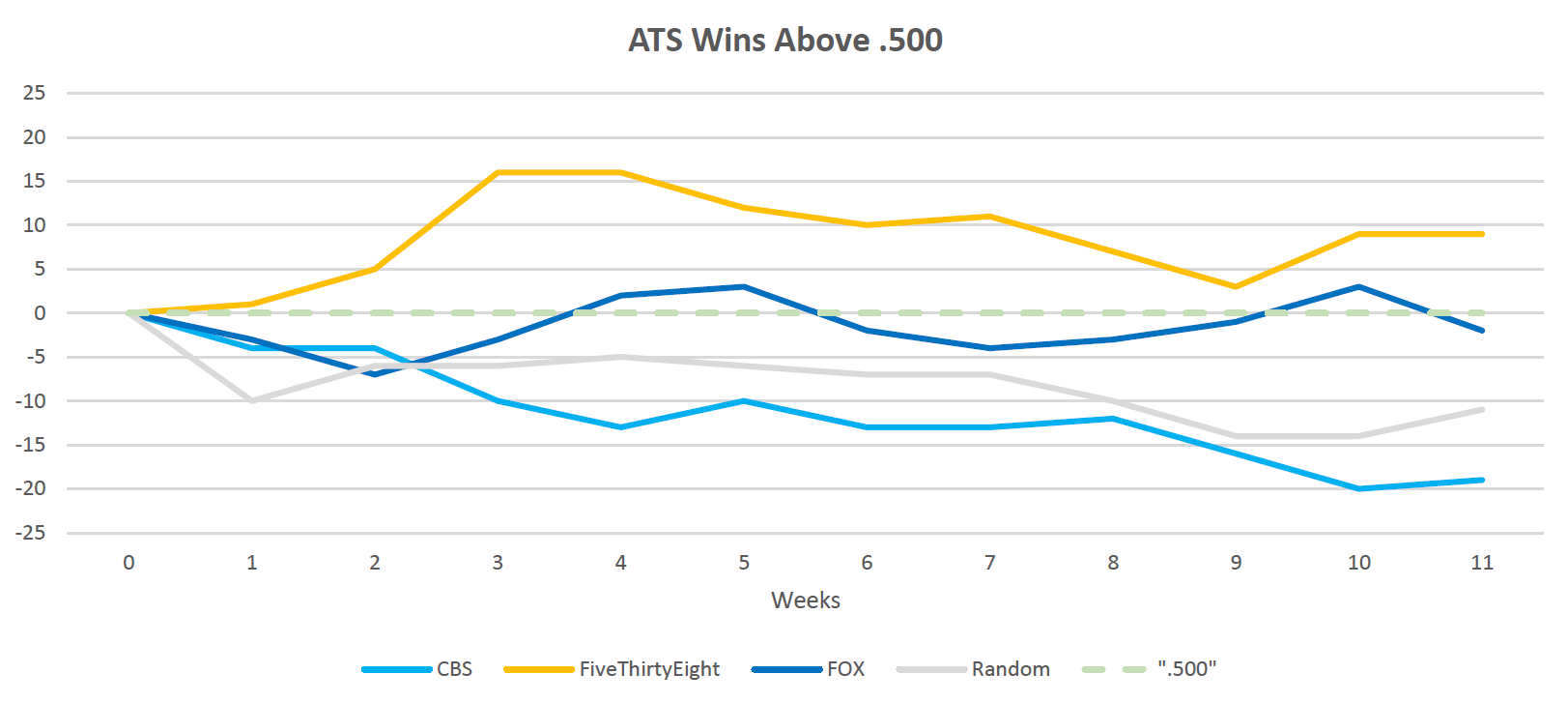
Data Source: CBS, FiveThirtyEight & FOX
That’s it people. Short week, gobble-gobble.
Week 10 - Big Picture with Small Multiples
Share Week 10
At the end of the week 5 post I listed in a table the “Average Model-Projected Win Probability for Changed Picks”, which now that I read the title have no idea what it means. Actually, it was meant to show the confidence that the data models had in their changed picks from the pre-season choices, by win/loss split. That little throw away insight got me thinking about looking at these numbers at a larger level, for all pick sources for the season to date.
There have been hints at what is presented this week right from the beginning, with an understanding that with only so many human experts per panel unanimous votes and high levels of confidence probabilities were more likely to occur than in the data models. Below we visualize this and see if anything interesting comes to the fore.
Two versions of the same data appear below. Each presentation may be considered an instance of small multiples, a data representation that is especially astute at making comparisons across many data points. See which one tells a story more clearly.
In the first instance we line up the sources across the ten weeks to date. The order of the bars is identical week to week, first the two expert panels, CBS and ESPN, followed by the two data models, FiveThirtyEight and FOX. The green bars extending up from the middle (50% to 90+% pick) represent the average confidence probability of winnig picks, the black bars extending downward show the average confidence probability of incorrect picks.
Data Source: CBS, ESPN, FiveThirtyEight & FOX
The second chart has the same data set but broken out by pick source across the top and the weeks down the lefthand side. This version makes it easier to compare confidence probabilities per source across weeks.
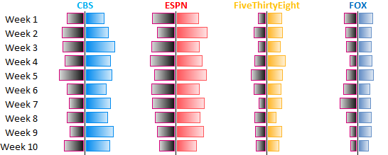
Data Source: CBS, ESPN, FiveThirtyEight & FOX
Between the two graphs it is clear that,
- the expert panels are routinely confident, cocky really, in their choices;
- the data models are much more restrained in their picks’ confidence probability;
- FOX is most modest, but appears to be most consistent;
- FiveThirtyEight looks to have the best ratio of win/loss confidence probability.
However, all of the above is quite relative. A pick source may have only a couple of incorrect picks in any given week and if they had been overly confident the black bars would have you believe they had a rough week. In a sense they have, confidence in their picks should be questioned. I bring this up to remind the reader that it is not just getting picks right that matters but the level of confidence in the pick, which can help determine how trustworthy a source may be considered.
To that end I’m throwing in a freebie chart to smooth away the week to week anomalies and see big picture how much the sources can be trusted. Below is a simple bubble chart that represents the following:
- confidence probability of picks (x-axis)
- winning percentage of picks (y-axis)
- data source (color)
- number of picks (size)
Lastly, I have included a 45 degree gray line to serve as a guide to determine which picks are performing up to snuff and which are not.
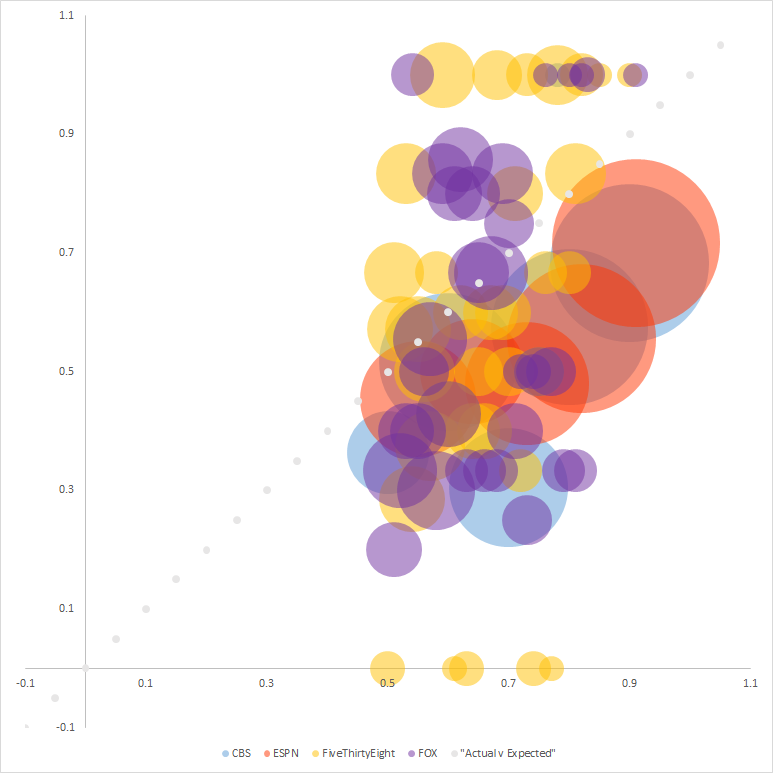
Data Source: CBS, ESPN, FiveThirtyEight & FOX
The only sources above the diagonal line are from FiveThirtyEight and FOX. This says to me not to put too much credence in the expert panels. While most of the expert picks are above the outright .500 line (not visualized, but you can use your imagination), that would cut horizontally across the chart, this representation shows that the level at which picks made by the experts win are well below their expected frequency.
Week 9 - Team Performance: SUP & ATS
Share Week 9
It would have been nice to include everyone this week but our spotlighted team from last week, the Cleveland Browns, couldn’t pull the upset and as a result they will be partly left out from this week’s visual representation. Initially I thought this was inconvenient and a break in the streak of good luck I’ve had in the way the season has played out, being conveniently aligned with the visuals picked out, but then I realized this is equally perfect and suits the Browns’ season just right.
Last week we looked at the universe of possible outcomes for each team over thousands of simulated seasons. This week, with every team having played eight games, we look at reality to date.
Below is a treemap (wiki link) that shows the share of wins by team, division, and conference as a spatial representation. This is done by grouping division teams spatially and by color, and splitting the conferences. Additionally the user may toggle between the two wins representations: straight up (SUP) and against the spread (ATS).
Vis Source: Mike Bostock
While the above is not immediately linked to our picks’ sources, it is not tangential either. The halfway point of the season seems like an appropriate time to see where we stand, who has under- or over-performed, and help recalibrate our knowledge and expectations moving forward.
Week 8 - Here’s to Cleveland
Share Week 8
Not a great year for the Browns to date. Through the first two months of the season they have a big fat doughnut in the win column, their loss total inching inexorably toward double digits. That’s pretty rough but how likely is this? Let’s look at some data to get an idea and get a grasp on the bigger picture as well.
In week 2 we took the pre-season game-to-game probabilities of FiveThirtyEight and FOX to determine the average expected wins for each team and thus create a projected final standings. We used these same game-to-game probabilities and ran the seasons over and over again, ten thousand times. The purpose was to identify the probabalistic outcomes for each team. If you can write a for-loop, you can do statistics, right?
Chance of Seattle going undefeated: 0.12% according to FOX; the Jets going winless: 0% chance according to FiveThirtyEight and simulated seasons (phew!); Cleveland winning 8 games: 9.6% and 5.7% according to FiveThirtyEight and FOX, respectively. Those last odds look equal parts welcoming and wishful thinking at this point.
Below is the full chart with hover tool to allow for reviewing the chances for each team (y axis) reaching specific win totals (x axis). The first is from FiveThirtyEight the latter from FOX.
Data Source: FiveThirtyEight
The zero wins for Cleveland seem a bit “unfair” when both FiveThirtyEight and FOX gave them about a 60% chance of winning between 4-7 games. The lower end of that projection may still be in play but the higher almost certainly not.9 So what happened, has the team been unlucky? I cannot say from watching the games (who watches Browns games?) but we can get an idea from looking at some game specifics and cumulative numbers to date.
For one, the Browns have never been favorites in a game to date, despite five of their eight games being at home. On the flip side they have beated the spread four of eight times, so there’s that (next week we’ll present a visual that will allow for the toggling between SUP and ATS wins to see how they compare to other teams). Nor has Cleveland fooled any of the models but once. Through eight weeks and across four models/panels (CBS, ESPN, 538, & FOX) they have been picked against 31 of 32 times (talk about no one believing in them). Only in the most recent week were the Browns able to fool sway the FOX data model10 into picking them over the Jets.
Aside from some close games (a 2 point loss at TEN and half of the loses coming by 5 or fewer points) when we take a big picture view the Browns have the worst point differential overall (TB is worse at home; NYJ & SF are worse on the road).
There are many possibilities before the beginning of the season, some more likely than others (see week 2 below), a few quite obvious in retrospect (never a remarkable talent). But the football gods can be a fickle bunch and it appears that Cleveland is taking the brunt of that so far. Perhaps a World Series win will make it all worth it.
Data Source: FOX
Week 7 - Any Port in a Storm
Share Week 7
More input is not always a good thing apparently. I would have hoped that the common and unanimous votes among the game picking sources, by necessity requiring an overlap of weights and perspecitve and thus being more restrictive, would result in a better correct pick percentage than relying on fewer sources. In five out of seven weeks this did not prove to be the case.
Mixing picks between expert panels and data models usually resulted in a middling win percentage between the two and in one instance, week 6, even provided a percentage worse than either. The thinking was that there would be a majority of weeks like weeks 5 & 7 where the combination of inputs were greater than their parts. Consensus so far appears to compromise results, akin to “Too Many Cooks”. We have yet to pass the halfway part of the season so I hold out hope that results will improve.
Data Source: CBS, ESPN, FiveThirtyEight & FOX
At the very least, in most cases the consensus model picks were better than just going with the favorite. So there’s that.
An additional thinking beyond the unanimous picks being a safe way to choose winners (SUP) was that surely it would provide valuable input for a suicide pool.7 Where would we be if we followed the crowd (of experts and models), especially when they’re all pointing in the same direction? Most likely for a wipe out. Below is a pie chart8 (wtf?!) representing the random surfing of going with the unanimous picks.
Suicide Squad Wipe-Out

Data Source: CBS, ESPN, FiveThirtyEight & FOX
Week 1 is in the center with each successive week occupying the next concentric circle outward, ending with the most recent week, week 7. Light blue represents the proportion of correct picks, dark blue the proportion of incorrect picks. Starting with week 2, the second circle out from the center, the graph introduces black as the color that represents the lost opportunities of previously incorrect choices. This is a fanciful illustration of, to mix metaphors, how difficult it would be to thread the needle and survive into week 8, just under 3%.
That low chance of survival is slightly overly optimistic due to the naive representation above which simply calculated percentages and did not take into consideration previous picks (see footnote re suicide pools and picking teams to see how this matters).
Maybe you’re in the middle of a storm, the sky is falling in on your head, the waves are crashing over your little boat, the oars are about to snap…
Week 6 - Arbitrage (maybe)
Share Week 6
Most of the previous posts have had to do with wins and loses straight up (SUP). There was a brief dipping of the toes into performance against the spread (ATS) back in week 3 but that had more to do with home team performances by conference and did not look at predictions. Today we take more of a dip into predictions ATS and evaluate performances to date.
There are four sources of ATS predictions:
- CBS expert panel
- Random predictor
- FiveThirtyEight data model
- FOX data model
I will take these four and deal with them in pairs first, for reasons that will become clear, CBS v. random & FiveThirtyEight v. FOX.
CBS panel predictions for ATS are devised similarly to SUP: each expert gets a vote; majority determines pick; in case of tie, dog gets the pick (as compared to road team for SUP); and the votes are regularized to avoid harsh Brier score (BS) penalties for unanimous choices.
The random number generator simply takes the dog if it returns 0.500 or larger. That’s it. No regularization beyond that. The pick is made and we move on.
Given the nature of picking ATS, where favorites have to win by a certain amount of points, it stands to my expectations that the random generator would fare better here than in SUP, where no knowledge is leveraged. This expectation has so far turned out to be validated.
Though by some fluke coincidence the number of correct picks by the Random “models”[fn: two separate number generators were implemented, one for SUP and one for ATS] is identical, 41, for both SUP and ATS through week 6, this number carries different significance in each context. Forty-one correct picks for SUP places it last in the standings against the other sources while beating out the CBS experts in ATS: 41 correct picks versus 38 for the human panel.
Predictive Results, Against the Spread (three games tied ATS)
| Source | Season Brier Score | Season Wins |
|---|---|---|
| Random | 0.351 | 41 |
| CBS | 0.329 | 38 |
| CBS (regularized) | 0.305 | 38 |
In fact, the random ATS picks come close to matching the data model choices but I’m getting ahead of myself. Let’s introduce those models and how we calculated their picks ATS.
The data models of FiveThirtyEight and FOX do not make outright predictions against the spread. This is not technically true for FOX but due to the nature of ever changing lines and the need to standardize a source (Sportsline in this article) to measure against I am treating the two models in a similar way.
For both data models we use the in week most up-to-date projections (“in situ”). FiveThirtyEight provides an ELO-based spread for each game while FOX provides average final scores based on 501 game simulations. I used the FiveThirtyEight lines and FOX score differentials to determine who the models favored and by how much. I compared the data models’ lines against the current week’s line and used the discrepencies as proxies for picks ATS.
Examples of what I mean can be outlined in the table below.
| Week | Game | Home Line | 538 Home Line/Pick | FOX Home Line/Pick |
|---|---|---|---|---|
| week 1 | LA @ SF | 2.5 | -1 (SF) | 6.1 (LA) |
| week 3 | SF @ SEA | -9.5 | -8.5 (SF) | -10.3 (SEA) |
| week 6 | NYJ @ ARI | -7.5 | -6 (NYJ) | -4.2 (NYJ) |
Now a quick rundown through the rows to explain what is listed.
- Week 1 - SF is a 2.5 point dog; FiveThirtyEight views SF as a one point favorite; FOX thinks of SF as an even bigger dog.
- Week 3 - SEA is favored by 9.5; FiveThirtyEight sees SEA as less of a favorite; FOX likes SEA even more.
- Week 6 - ARI is favored by 7.5; both FiveThirtyEight & FOX consider ARI less of a sure thing, they pick NYJ.
The above comparisons were done on a game by game basis. Where games ended in a tie ATS (3 times) results were not calculated. In the unlikely event that lines matched (FiveThirtyEight == SporstLine OR FOX == SporstLine) game picks were not made for that model on that game (there was no advantage in using that specific model, no arbitrage).
Okay, enough with the foreplay. Let’s get to this week’s visualization. Below are a pair of diverging stacked bar charts, one a piece for FiveThirtyEight and Fox related to their ATS picks performance. Each horizontal bar represents a week of games to date with week 1 at the top going down in chronological order to week 6.
Data Source: FiveThirtyEight
There is an invisible line down the middle of each graph that demarcates the boundary between away picks (left) and home picks (right). The sections on either side of this boundary have two different hues. The lighter hues, the ones grouped around the middle, represent the number of incorrect picks (home or away). The darker hues on the end represent the correct picks or the “wins”.
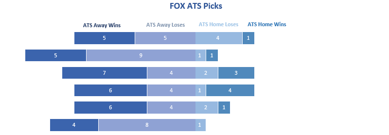
Data Source: FOX
I find these representations to be very helpful in identifying:
- General skew - FOX clearly prefers the road teams; FiveThirtyEight is more balanced in its choices
- Pick breakdown week to week - FiveThirtyEight was road heavy in week 3, home heavy in week 5
- Zero categories - zero home loses FiveThirtyEight/week3; zero home wins FOX/week 6; zero away picks FiveThirtyEight/week 5
- Total weekly selections - when bars line up, or are close to lining up (FOX: weeks 1,3,4,&5), you can quickly see a difference in length providing a visual distinction total games.
While helpful in giving an overview of comparative performance I will spare you the work of summing the numbers to determine the final breakdown of the above. The pick count breakdown of above:
Predictive Results, Against the Spread (three games tied ATS)
| Model | ATS Away W’s | ATS Away L’s | ATS Home L’s | ATS Home W’s |
|---|---|---|---|---|
| FiveThirtyEight | 21 | 15 | 21 | 25 |
| FOX | 33 | 34 | 11 | 10 |
If you’re going to use a model, go with FiveThirtyEight’s ATS.
Week 5 - Less Words, More Empathy
Share Week 5
One motivating drive of this ongoing piece is to set up the premise using words, tables, and simple graphs, especially in the beginning, and then allow subsequent visuals to speak for themselves and deliver the information. Thus the drop off in word count from week to week is intended both by design and disposition (lazy efficient, if you will).
A recurring and expected theme is that football game predictions are difficult, not quite stock picking difficult where a blindfolded monkey is likely to outperform you in the market, but difficult. For that reason I try to keep my derision to a minimum, especially when it comes to the data models. I don’t want to be a on the machines’ (s)hit list when they take over.
This week the game prediction results SUP aligned perfectly for my implementing a bullet graph to show where we stand to this point in the season. Specifically, through week five the human expert panels, both CBS and ESPN, accumulated an identical number of SUP wins, 43. This coincidence allows for the traditional three category background of the bullet graph (and the added benefit of more easily appropriating available code; lazy efficient), but I am getting ahead of myself.
Below is an example graph with labels for clarification. It is fairly self-explanatory and we will be going over the parts a second time when we breakdown the game prediction results further below. There is really no need then to continue reading this paragraph. I will assume you will take that not so subtle hint to skip ahead. Now that you’re gone I’ll just ramble a bit… about… puppies? Sure, they’re adorable. I don’t care if you’re not a dog person you have to admit they are the cutest things around. Better than babies. Okay, I’m done now.
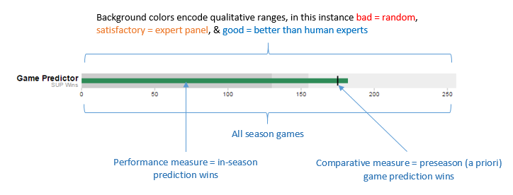
Using the above image as a guide we can confidently make sense of the visual below. I am going to spell it out so if you already understand how to read these graphs jump ahead and/or see you next week.
First, the grey backgrounds from left to right: 32 random correct picks, 43 expert panel correct picks, of 77 total games.
Second, the color bars: 45 in season/situ FiveThirtyEight correct picks shown by the orange line & 42 in season/situ FOX correct picks shown by the dark blue line.
Third, the floating black marks or “comparative measures”: 46 and 45 preseason/a priori correct picks by FiveThirtyEight and FOX, respectively.
Bullet Graph of SUP Wins thru Week 5
Data Source: CBS, ESPN, FiveThirtyEight & FOX
Bullet graph take aways:
- Preseason data models have been the top performers with respect to correct picks SUP.
- Both of the in-season data models, FiveThirtyEight & FOX, have under performed their preseason win totals to date.
- FiveThirtyEight has been the best in-season game predictor so far, followed by both expert panels (CBS & ESPN), and the data model used by FOX.
- Our random picker is performing at less than 50% correct picks. Perhaps those blindfolded monkeys aren’t such hot stuff afterall (so far!).
Something the graph does not show are the number of changed picks per model. It may be tempting to make the incorrect leap, using just the above graph, into thinking there has been a change of only a game or two so far. Not so. FiveThirtyEight has made 5 in-season pick changes (2 wins/3 loses) and FOX 13 (5 wins/8 loses).
Of course the other element the graph does not cover is BS score (nor is it intended to). This will be a focus in the next week or so but I will provide the following probability table as a wrap up. Make of it what you will.
Average Model-Projected Win Probability for Changed Picks
| Wins | Loses | |
|---|---|---|
| 538 | 0.51 | 0.55 |
| FOX | 0.55 | 0.60 |
I couldn’t resist my 2¢: the modles don’t give you much to choose between; when they’re confident they’re wrong, when they’re less confident they may win. Make of it what you will, after all.
Week 4 - I’m Just a Professional
Share Week 4
That’s what everyone keeps saying and I’m getting sick and tired of hearing it. Now that I’m done channeling my inner John Creasy let’s get on with what is turning into a less than impressive showing for the game pickers. I guess there’s a reason people get paid big bucks for calling it like it is, while the rest of us make cute little visualizations about others’ struggles.
Week 4, first week with a Bye so we had 15 games instead of the usual 16. Who broke even? Not CBS or FiveThirtyEight. Uh-uh, each of them had only 7 wins SUP. FOX did them one better and our big winner was ESPN with 9 wins for a weekly winning percentage of 60%. That wouldn’t even get me a passing grade in Spanish class. Los siento, expertos!5
On the season the experts/models are not much more impressive. Each of them are lingering, like a stale fart, at 35-37 wins. Shiiit, my random generator has 28 wins alone.6
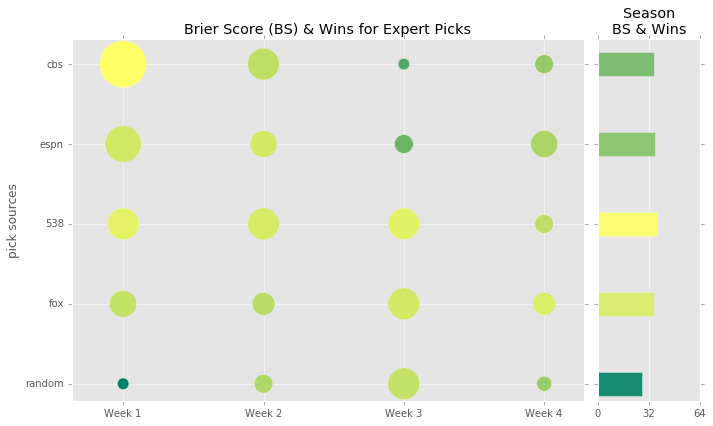
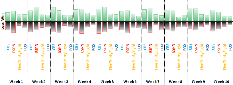
Data Source: CBS, ESPN, FiveThirtyEight & FOX
Above is a representation of the weekly (x-axis) performances by source (y-axis). The larger the cirlce the more wins for the given source/week.

The lighter and more yellow the color the better performing on the Brier Score (BS), darker and green colors represent the opposite.
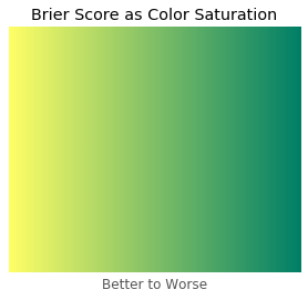
On the right side of the main plot we have a second chart that summarizes the season to date. Each bar is in line with the sources on the original y-axis and their length represents total wins SUP. The color saturation follows the same meaning as for the circles.
Bear in mind however, that the colors are relative to the universe of inputs. For instance, in a world where G-d is making game predictions and is getting everything right, naturally, he/she would have a BS of 0, because again it’s G-d, and the yellow would represent that low of a number. Meanwhile, someone who got every pick 100% wrong, a mush, would have a BS of 1 and a color of dark green, ironically the color of money. Those colors are represented above, but again they are relative to the universe of these 5 sources. This decision was made to make differentiation more easy.
Week 3 - Well, That Escalated Quickly
Share Week 3
Rough week for the favorites, human prognasticators, and predictions in general. Where should we even start? Ten of 16 games were unanimously agreed upon (SUP) by the panels/models, but half of them proved incorrect. Meaning if we were using the unanimous model selections there would be a just better than one-third chance (34%, 0.875x0.778x0.5) of making it to Week 4 in a suicide pool. This is definitely something that’s made me repeatedly curious, you can expect a graphic of some sort in the coming weeks.
We mentioned getting into the betting line and this is us tipping in our toe. Of the 16 betting line favorites 9 lost outright, 6 of which were home favorites. The breakdown of the aforementioned favorite performances by week to date:
| Week | Betting Line Favorite W’s SUP | Home Favorite W’s SUP |
|---|---|---|
| Week 1 | 62.5% (10/16) | 55.6% (5/9) |
| Week 2 | 62.5% (10/16) | 66.7% (8/12) |
| Week 3 | 43.8% (7/16) | 50% (6/12) |
Below is an interactive graph showing game outcomes by home teams through week 3. The x-axis displays the number of points the home team was either favored or not-favored by. The y-axis displays the point difference (PTD) of the final game score for the home team (positive for wins, negative for loses; it’s not rocket surgery, stick with me). The 4 quadrants created by these two axes, starting in the top right box and moving clockwise, are winning favorites (+x, +y), losing favorites (+x, -y), losing dogs (-x, -x), and winning dogs (-x, +y). The color/shape of the marks indicate conference (red circles for AFC, blue squares for NFC). Game details such as teams, final score, and home line can be identified by hovering over the marks. Lastly, there is a 45-degree dashed line bisecting quadrants I and III, winning favorites and losing dogs, respectively. This is the home line that identifies wins/loses against the spread (ATS). The size of the circles/boxes are an indication of how greatly the final PTD differed from the home line.
Data Source: SportsLine and Code
Plans are to update this graph weekly,4 leaving a static image in its place to capture the week 3 snapshot:
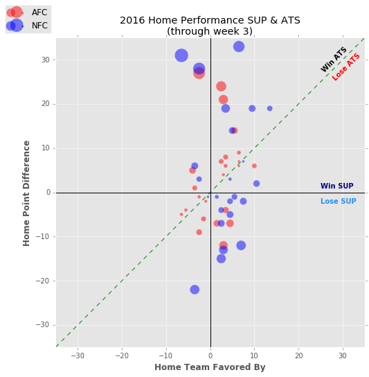
Data Source: SportsLine and Code
The two data models, FiveThirtyEight & FOX, performed best, both for wins and Brier Score (BS). Meanwhile, the humans of CBS and ESPN proved easily swayed by favorites, picking 14 of 16 to win (though there was a slight discprency on two of the choices). As we have noted in numerous places in this piece the experts are prone to unanimous votes of their own, something we have been smoothing to help damper the impact of such situations. Despite the “dampering” both data models leap frogged our previous front runner, CBS, putting themselves in the top too spots followed by the expert panels, with not much to differentiate this latter pair. The Random game picker incidentally made the greatest gains (keep in mind a low Brier Score, BS, is preferable) and following another similar week may be breathing down the necks of the “experts” (too soon for quotes? time will tell).
Predictive Standing, Straight Up (with Wk 3 change in parantheses)
| Source | Season Brier Score | Season Wins |
|---|---|---|
| FiveThirtyEight (in situ) | 0.217 (-0.002) | 30 (+10) |
| FOX (in situ) | 0.253 (-0.009) | 27 (+10) |
| CBS (regularized) | 0.281 (+0.063) | 28 (+5) |
| ESPN (regularized) | 0.282 (+0.046) | 27 (+7) |
| Random | 0.353 (-0.049) | 22 (+10) |
Week 2 - Back to the Future Full Season Recap
Share Week 2
As we plod along tracking game prediction accuracies week-to-week it may be tempting to get lost in the most current data and side tracked by the latest revisions. With that idea in mind let us now take a moment to look forward and document what the two quant models, by FiveThirtyEight and FOX, predicted for the season by using their respecitve game-by-game winning probabilities.
FiveThirtyEight provides a team-by-team season win total, released preseason and updated weekly. No need to reinvent the wheel, however there is, to the best of my web surfing, no breakdown of how this looks by conference and/or division. That could be meaningful for playoff purposes. Below is table of the preseason expected wins for FiveThirtyEight. Teams are grouped first by conference, then by division, and sorted by overall wins, followed by division and conference wins. I have highlighted the division winners and the additional two wild card teams per conference.
FiveThirtyEight Game Probability Season Standings
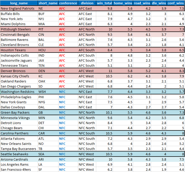
Data Source: FiveThirtyEight
FOX does not even provide an overall win total for the teams, again to the best of my web surfing, which made this excercise worthwhile just to see where they stand big picture. The table is similarily grouped and sorted. By the way, the wins for both tables were calculated with the following code.
FOX Game Probability Season Standings
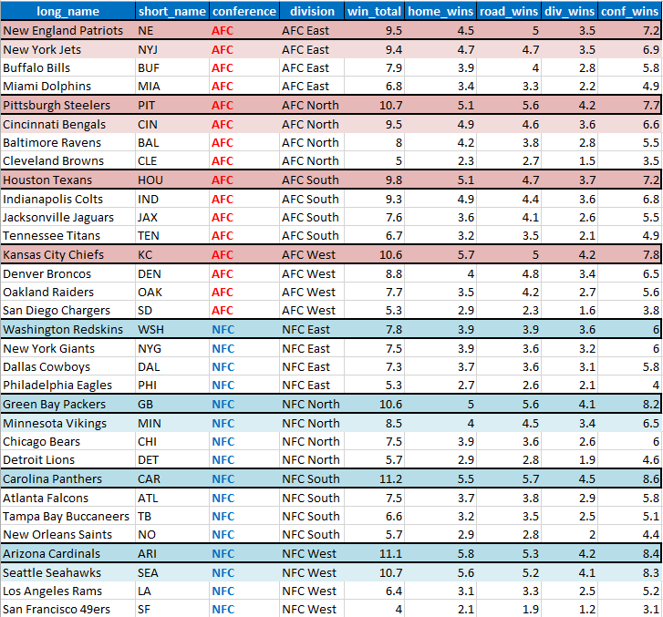
Data Source: FOX
Clearly a good amount of overlap but also some interesting differences in details to keep in mind moving forward (win distributions by conference and division; outcome of competitive divisions [NFC East, especially]).
Notes & Updates to Last Week
FiveThirtyEight’s model improved against its preseason predictions in both wins, making one game prediction change (from CHI to PHI), and BS. FOX recalibrated from its preseason predictions with less success. FOX’s model made two game prediction changes, but only one of them turned out to be correct (IND to DEN). Additionally, the probabilites for wins were further off post-recalibration. CBS continues to hold strong, slightly edging out FiveThirtyEight’s model with respect to BS and predicting three more games correctly.
Predictive Standing, Straight Up
| Source | Season Brier Score | Season Wins |
|---|---|---|
| CBS (regularized) | 0.218 | 23 |
| FiveThirtyEight (in situ) | 0.219 | 20 |
| FiveThirtyEight (a priori) | 0.221 | 19 |
| CBS | 0.232 | 23 |
| ESPN (regularized) | 0.236 | 20 |
| FOX (a priori) | 0.255 | 17 |
| ESPN | 0.256 | 20 |
| FOX (in situ) | 0.262 | 17 |
| Random | 0.402 | 12 |
Things to look out for:
- quant model recalibrations and subsequent performance (FiveThirtyEight has a 1.00 win% on changes; FOX is at 0.50, granted on a tiny sample set)
- random predictive performance (improved from last week)
- continue to monitor human/experts against regularized panel probabilities, possibly drop outright votes based on future performance
- suicide pool survival based on unanimous picks (& win% for same)
- Unanimous picks: Week 1, 7/8 correct (87.5%); Week 2, 7/11 correct (77.8%)
| away | home | away_score | home_score | winner | unanimously |
|---|---|---|---|---|---|
| BAL | CLE | 25 | 20 | BAL | correct |
| CIN | PIT | 16 | 24 | PIT | correct |
| DAL | WSH | 27 | 23 | DAL | “nobody believed in us!” |
| MIA | NE | 24 | 31 | NE | correct |
| NO | NYG | 13 | 16 | NYG | correct |
| SF | CAR | 27 | 46 | CAR | correct |
| TEN | DET | 16 | 15 | TEN | “nobody believed in us!” |
| SEA | LA | 3 | 9 | LA | “nobody believed in us!” |
| TB | ARI | 7 | 40 | ARI | correct |
| ATL | OAK | 35 | 28 | ATL | “nobody believed in us!” |
| IND | DEN | 20 | 34 | DEN | correct |
Week 1 - Humans Haven’t Been Replaced, Yet
Share Week 1
Let’s start slow for this first installment. We have all season to get to know each other and get fancy-shmancy with the analysis. We will introduce our most basic metric, the Brier score (BS), and layout the predictive performance of the major outlets we’re covering. As the section’s heading above hints at the expert panels, the humans, did a solid job of demonstrating their worth. It cannot be any earlier in the season but I wish to congratulate the CBS panel especially for coming in first, in both wins and predictive accuracy. Time will tell if this was a happy fluke or a sign of things to come.
Predictive Standing, Straight Up
| Source | Week 1 Brier Score | Wins |
|---|---|---|
| CBS | 0.174 | 13 |
| FiveThirtyEight | 0.210 | 10 |
| FOX | 0.254 | 9 |
| ESPN | 0.256 | 11 |
| Random | 0.520 | 5 |
Week 1 Notes
- The CBS committee had only of 3 of sixteen games wrong, incorrectly picking CAR, ARI and LA. The ARI choice was the most damaging as it was an unanimous selection resulting in the largest penalty possible for a prediction, 1.0. This was off-set by solid and confident choices in other places, such as the 3 other unanimous picks that did work out: HOU, SEA and PIT. This right away brings to mind the thought that human panels, certainly ones as small as these, are prone to over estimating probability of wins (granted the way I am using their input is not the intended purpose, but that’s what makes it so fun). It is doubtful that the data models we will be dealing with in this exercise will ever give a probability of 1.00. This means that the human panels leave themselves open to big wins and big loses, as far as the Brier score is concerned (see table below showing average probabilities amongst the sources for the week, with the range of possible scores).
| Source | Avg Prob of Pick | Best Possible BS | Worst Possible BS |
|---|---|---|---|
| CBS | 0.766 | 0.055 | 0.586 |
| FiveThirtyEight | 0.633 | 0.135 | 0.401 |
| FOX | 0.658 | 0.117 | 0.433 |
| ESPN | 0.813 | 0.035 | 0.660 |
| Random | 0.789 | 0.045 | 0.623 |
- This is something worth keeping an eye on. If it turns out that this becomes too much of a detriment I will consider regularizing expert selections (numerators +1 & denominators +2).3 In fact, I may just do this moving forward to have at my disposal. The choice of team will remain the same per panel but this step will help mitigate the exuberance of a unanimous decision. Again, time will tell which is the wiser approach.
| CBS Panel Votes | CBS Panel Votes, Regularized | ESPN Panel Votes | ESPN Panel Votes, Regularized |
|---|---|---|---|
| 4/8 (50%) | 5/10, (50%) | 5/9 (55.6%) | 6/11 (54.5%) |
| 5/8 (62.5%) | 6/10, (60%) | 6/9 (66.7%) | 7/11 (63.6%) |
| 6/8 (75%) | 7/10, (70%) | 7/9 (77.8%) | 8/11 (72.7%) |
| 7/8 (87.5%) | 8/10, (80%) | 8/9 (88.9%) | 9/11 (81.8%) |
| 8/8 (100%) | 9/10, (90%) | 9/9 (100%) | 10/11 (90.9%) |
- FiveThirtyEight had 2 fewer overall correct choices than CBS but, as the above table suggests, the probabilty of these choices were low enough to not penalize their BS rating too greatly (avg of 0.588). When we dig a little deeper we see that both data models had lower averages for their poor picks than the human votes. What can account for this human confidence? Group think, hubris, more information? It could be as simple as our not taking more expert inputs into consideration. A short term solution would be combining the two panels into one. Something else to keep track of moving forward.
| Source | Avg Prob of Correct Picks | Avg Prob of Wrong Picks |
|---|---|---|
| CBS | 0.769 | 0.750 |
| FiveThirtyEight | 0.660 | 0.588 |
| FOX | 0.666 | 0.648 |
| ESPN | 0.808 | 0.822 |
| Random | 0.699 | 0.830 |
- Half of the games were unanimously agreed on by the panels/models, 7 correct and 1 wrong.
| away | home | away_score | home_score | winner | unanimously |
|---|---|---|---|---|---|
| CHI | HOU | 14 | 23 | HOU | correct |
| CLE | PHI | 10 | 29 | PHI | correct |
| GB | JAX | 27 | 23 | GB | correct |
| MIN | TEN | 25 | 16 | MIN | correct |
| SD | KC | 27 | 33 | KC | correct |
| MIA | SEA | 10 | 12 | SEA | correct |
| NE | ARI | 23 | 21 | NE | “nobody believed in us!” |
| PIT | WSH | 38 | 16 | PIT | correct |
-
There’s currently no difference between the “a priori” and “in situ” model simulations. Week 2 and beyond will introduce divergence between these two models and we will definitely be keeping an eye on how well the FiveThirtyEight and FOX models “learn” during the season.
-
Performace ATS will be allowed to play out for another week or two in this space before being introduced. Part of the delay is considering how to include FiveThirtyEight and FOX models into the head-to-head match up with CBS. We have our ideas, are pretty confident of how to go about it, but want a little more time to get the wrinkles worked out and automated.
Notes
intro
1 Except for NBC, at this point (week 1). These punks have not made their experts’ picks readily available, at least not in the panel-friendly way of CBS and ESPN. ↩
2 They are in fact all men. Sorry ladies. ↩
week 1
3 Not a bad policy in dealing with prognostications in the real world either. ↩
week 3
4 next week update: Um, yeah-no. I’m not going to do that. Assuming each week has an update-able graph that would result in 130+ updates over a season (week1, 16 updates; week2, 15 updates… 16 + 15 + …. + 3 + 2 + 1). Instead we’ll let each graphic run for that week and maybe we’ll update them all at the end of the season. Once. ↩
week 4
5 Damn. I wish I could enter an upside down exclamation point for this sentence. ↩
6 Two Matthew McConaughey references in the same week. Let’s make that the record. ↩
week 7
7 For those who are not familiar with this term/league, generally speaking each contestant must select one team per week to win; lose and you’re out; pick correctly and you move on to the next week; continue until there is only one person remaining; you may NOT pick a team more than once in a season. ↩
8 Originally I thought of generating a tree branch visual of suicide paths but the itertions are at 95k+ through week 7 alone, for the still surviving paths, alone… So no to the tree branch vis, for now. ↩
week 8
9 This is based on intuition. I did not break out win probabilities for first and second half of the season. Get your nerdy cousin to do the math, we’re keeping it high level here. ↩
10 This is an in-season pick change and is indicative of the poor performance FOX has had on their revised picks to this point in the season (so far the in situ FOX model has done worse on both overall picks and Brier Score than the pre-season release). ↩
week 14
11 You see what I did there? I jiujitsu’d your ass. ↩
week 17
12 We never did find a way to attribute against the spread (ATS) picks to ESPN. ↩