In this Mix we’re gonna take a tour of infographics that deal with beer, its presentation and most importantly pairings with various food categories. It doesn’t take much talent to enjoy drinking (no, I’m serious) but with a little knowhow even this most natural activity can be heightened. Ultimately you can be a more skillful tippler and these infographics provide a solid base to get you there.
Six primary images have been divided into three levels: novice (the beers themselves and their serving glasses), veteran (pairings with specific foods) and gourmand (general overall framework).

Ripe Marula Fruit (YouTube)
I.
The beer style landscape is presented in broad strokes by this Business Insider image [1]. The two main families of beer, ales and lagers, are surrounded by their most common categories with further sub styles branching off from each. While not an exhaustive rendering of beer styles I appreciate the clarity, introductory use of color, and balance of design in this image.

Aside from the beer categories and styles which do most of the representative work there are two added touches that work well for being used sparingly. Instead of bombarding us with information detailing the nuance of every style we’re simply given a description of what distinguishes ales from lagers. Zooming in from the forest to the trees we are provided examples of certain styles once we dig down to the lowest level. In each case the limited information is relevant and helps bring up more of the right questions. Such as, what are examples of beer styles not linked to images and how would you describe the differences in flavors and styles further?
The colors used for the groupings, such as stout, wheats and sours, could have more accurately matched the colors we see in the real world. On the other hand that could have been too much to ask and resulted in too many distracting colors.
Overall I’m fond of this presentation, it funnels a lot of information, lays it out clearly and doesn’t overwhelm the reader. This is a good lay of the land for what can be expected in the world of beer.
II.
Next is an infographic that captures the use of 12 different types of beer glasses [2]. We start with the ubiquitous pint, that is more accurately labeled here a shaker pint, so called because it originated in the creation of cocktails (think shaken not stirred) and was arguably never meant for beer .

There is a lot to like in this simple image. We have glasses arranged in three rows from top to bottom in what appears to be increasing sophistication. I’d argue you’re more likely to have seen the glasses that appear on the top row over the second, and the second over the third row (syllogism!).
Each beer glass comes with a distinctive shape, name, corresponding beer style color and further information in small print underneath, should you choose to dig a little deeper. This is an effective set up in getting information across. It only takes a matter of moments to find beer by color, it doesn’t require much more effort to find beer glass names and the use of text to further delineate the differences is easy to read but also, and just as important, easy to ignore. Though static, the infographic provides a scan and zoom feel.
This is a deceptively simple infographic, perfect to cap off our “novice” group and a natural complement to our beer styles from the previous image.
The specificity of beer styles that go with each glass is not always provided. Some of the glasses indicate the style either by name or description but the exceptions may leave a less experienced beer drinker in doubt. Though I bring this up it is not necessarily a strong criticism, something I will return to by the end of this piece.
III.
We’re done focusing on beer alone and it’s time to move on to food complements. First up, and right at the heart of wine lovers, we’re talking cheese (shots fired). Garrett Oliver of Brooklyn Brewery has for years been making the case that beer is a more natural complement to cheese than wine. He has gone so far as to look at the chemistry and biology related to this topic for evidence to his claim. I’m not sure if you need to go to that level, certainly no one here is asking you to read the research papers , but a little home experimentation should suffice to convince you one way or another.
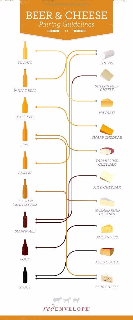
Some good things to like about this image [3]. Let’s start with the beers on the left-hand side. Clearly the decision was made to sort the beers top to bottom from lightest to darkest/heaviest. I am not as much of a cheese expert though I would admit I’ve had a majority if not all of these listed here, regardless of whether or not I would be able to match names to images. To my amateur cheese eye I would say much the same logic is extended to the cheeses. Going with that as my working hypothesis we’ll say that both the beers and the cheeses are listed in increasing strength of flavors from top to bottom.
Sticking with what I know better, the beers, this arrangement makes a good amount of sense and helps for quicker recall in finding the information you want. Should the beers have been scattered with no rhyme or reason it would add to the cognitive load needlessly (that’s right we’re gonna get a little sophisticated here, we are talking about cheese after all).
The lines connecting the style of beers with the complimentary cheeses is well done. The colors of the links match the respective beers, making it easy to identify and keep track of what goes with what. This being a beer and cheese pairing and not the reverse, it is fair to have the lines retain the color of the beer (a small detail that makes complete sense).
Adding to the simplicity and readability of the chart is the limiting of beer to cheese relationships at two. Even with a beer, let’s say the Saison, that goes with more than two cheese types, has no more than two lines taking off from the beer. This is a positive decision on two fronts. it helps focus on the essential pairings and cuts down on the noise, helping with intelligibility.
IV.
No need to stay all bougie let’s bring it back down for the hoi poi, like myself. From cheese to chips. You can say we’re jumping across the channel from the French to the British but I’m not talking about those kinds of chips, no sir we’re talking good ol’ American potato chips (http://vinepair.com/articles/beer-potato-chip-pairing-infographic/) (so take a longer across the pond).
I was unreasonably happy when I first came across this image [4]. I’m not even that much of a potato chip fiend, but like many things that remind you of childhood it brought me back to an earlier time perhaps touching a soft spot in my heart. While not having a particularly prominent role potato chips were certainly there, along with other junk foods and quarter waters, all of which were the only things that our measly allowances and scrap change that we picked up along the way could afford. Aside from that we also had to set aside what we could for random entertainment such as MAD magazine and of course the arcade.

Beyond the sentimental aspect of the food pairing I was also delighted by what I thought were spot on choices for the beer and chips combos. I have not yet tried out all of the matches listed but I have had all of these beers and nearly all of these potato chips at one point. It is the memory bank (“THINK Tank, Archy.”) I hit up to help appreciate and judge how well these pairings go together.
Being skeptical you might ask, how can I be so certain that the Porter and BBQ combination works or that the Saison and honey Dijon pairing is a good one (Rum Raisin , that’s how). A good rule of thumb to consider when looking to match or pair drinks with food is to consider whether or not you can do one of two main things: accentuate the flavors in the dish or balance them out. Much like the distinction between ale and lagers this is a high-level heuristic to help steer you in a generally good direction.
Don’t just take my word for it, look through this image, identify the beer and potato chips that you’ve had before and decide for yourself whether the combinations presented do one of those two main things. In some instances you may be surprised to find that it’s difficult to determine which of the two directions is more effectively being pulled off. When in doubt, get some firsthand experience and decide for yourself.

V.
I was hoping to get a beer and chocolate combination only infographic but after looking around I settled on the following because I found it to be the most appealing and I didn’t want to ignore it just because it included additional cheese pairings.
I find pairing chocolates and beers to be a bit difficult. Too often the chocolate overwhelms the beer and makes the drink appear watery by contrast. This naturally has to do with the type of chocolate and beer in question which is to say, once again, it’s all about the match ups in the pairings that you have at hand. Along those lines you will see two different approaches [5] when it comes to chocolates depending on the strength and flavor involved.
When we have the big chocolate flavors you will need a big beer, either to balance, as with the barley wine and dark chocolate combination, or to accentuate and play along with the flavor, as we see when it comes to chocolate cake and stout. The other pair of matchups deal with less strong chocolate flavors that are attenuated with either fruit or some percentage of milk. In these instances you want to back off on the strength of beer in order to avoid overwhelming the chocolate. Thus we see a natural complement between the wheat beer and the orange chocolate. I’m not so sure about the pale ale with the milk chocolate but I’m willing to give it a shot.
VI.
We now come to the grand daddy of infographics [6], as far as this piece is concerned. There’s a lot to process in one go so let’s take it in stages.
First off is the arrangement of the infographic itself. From left to right we see food components, the beer flavors recommended, the reasoning behind what’s going on and finally specific examples. I won’t be digging into individual examples, the reader can do that for themselves, and should. Stepping through the process outlined in this infographic and taking a moment to imagine the suggestions being made will go a long way to helping anyone get a better understanding of the interactions taking place.
We’re coming to this image after individual infographics that dealt with cheese, chocolates or potato chips alone. Yet here we see these same categories (forgetting about potato chips for a moment, even if they were tied into our childhood) being shrunk into one specific role, surely this is an oversimplification? Perhaps, but each example comes with qualifying elements. Additionally with the assistance of the interactions involved and examples provided I believe the reader gets a clear idea of the methodology and intention behind the pairings suggested.
This infographic ties back into the second one we covered, dealing with beer glasses. If you remember we did not in all instances have examples of beers that went with each glass. I pointed this out with the caveat that it wasn’t a major criticism on my part. The reason was dispositional. For a tool to actually help and teach and, arguably most importantly, eventually let the user move on without it being there as an ever present crutch, I think it’s important to not constantly have your hand held but rather be given a hint and indication of what’s possible. The learner should be free to experiment for themselves and see what works for them. This is also the case with this final and what appears quite exhaustive infographic.
Though many food types are covered none are drilled down into detail, rather examples are presented, reasons for interactions are provided and through this exposure I believe anyone with a little experimentation on their own and, yes a little guidance provided, is likely to develop first-hand experience and appreciation for the many ways that beers can be more fully enjoyed.

Notes
[1] Gould, Skye. “Everything you need to know about beer, in one chart” Business Insider. Business Insider Inc., 27 Dec 2016. Web image. 17 Jan 2017.
[2] “Inspired by today’s wiki wednesday, I made a quick infographic on glasswear” rebrn., 8 Jul 2015. Web image. 20 Jan 2017.
[3] ProvideCommerce. “Beer and Cheese Pairing Guide” visual.ly. Visually, Inc., 30 Jan 2014 Web image. 20 Jan 2017
[4] “The Perfect Beer Pairing For Every Potato Chip Flavor [Infographic]” VinePair. VinePair Inc., 14 Sep 2016 Web image. 14 Sep 2016
[5] Houseknecht, Caleb. “Perfect Couples” KegWorks. Dot Com Holdings of Buffalo., Web image. 20 Jan 2017.
[6] “Beer and Food Chart” CraftBeer. Brewers Association., 14 Nov 2016. Web image. 20 Jan 2017.