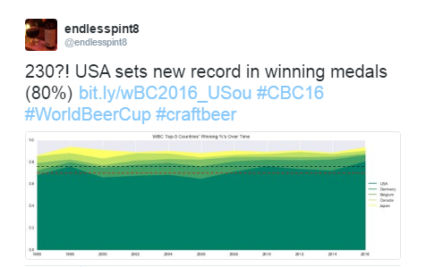
I told myself that I was done going over the disparity in numbers between the US and rest of the world with respect to the World Beer Cup. While what I wrote earlier was certainly not the definitive say on the matter, and nor was it meant to be, I thought I’d made my point. Until last week, when the WBC results made it for me by giving the US its largest metal haul ever, both in absolute and relative numbers. Based on previous entry and category counts I set the US medal count line at a cute over/under of 201. Final results: US won 230 of 287 awards,1 for a whopping 80% win rate. So just when I thought I was out they, well you know.
Originally, I made a simple area plot and posted to the Twitters to point this out but I soon realized this wouldn’t suffice, not for my curiosity anyway.
How Dominant
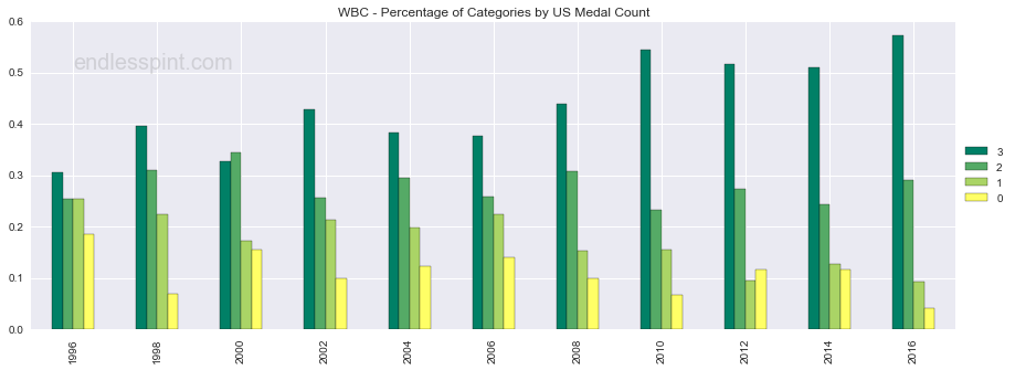
What kept bothering me was the blanket simplicity of the 80%. It somehow didn’t seem to cover the full story. What I ended up asking myself was how many medals were won by the US per category and by extension how often did the US sweep a category. I grouped the data by all categories competed for to date, identified when an award winner was from the US, and created a pivot table with years (x), categories (y), and US medal counts (z). This final table was used to create further plots. Below are three of these that help display the US medal performance, by percentage of events with specific medal counts, per year.
The first bar chart highlights that in 2016 the US swept more categories than ever, both in absolute numbers (55; though that cannot be gleaned from the chart) and percentage (57%).2
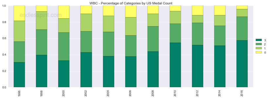
The second chart appears to do a better job at showing the discrepancy from both ends, the low number of categories the US was shut out of at the top in yellow and the sweeps in dark green from the bottom. Naturally, having a standard axis/border for these categories to take off from make them easier to read.
To bring home the message and make the reading from one year to another (hopefully) more effective I added horizontal lines for the following percentages: 50, 75, & 90.3 These lines can be instructive in comparing groupings of medal wins, e.g. the US has won 2+ medals in 75% of the last five WBC competitions.
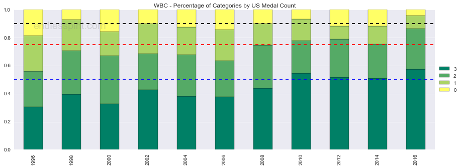
So just how dominant were the US breweries? They swept more categories than ever and were shut out of fewer categories than ever. That’s how dominant.
In What Way Dominant
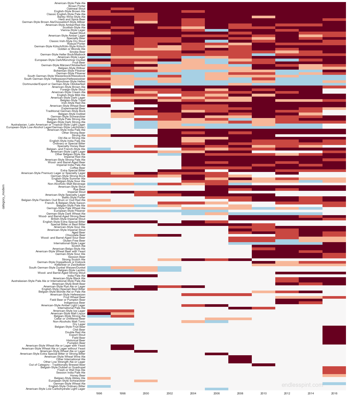
Having dug into the 80% a bit and gotten a more nuanced idea of the medal haul I next wanted to display this performance on a category level. Sticking with the previous pivot table I mentioned creating above I mapped the different US medal counts to colors and created a heatmap. Below you will find competition years across the x-axis on the bottom, in chronological order left-to-right; standardized beer category names along the left side y-axis, and the number of medals represented by colors: dark orange for 3 medals, orange for 2, peach for 1, light blue for 0, and white spaces indicate that a category was not competed for in a particular year.
Currently the heatmap is sorted in descending order of cup appearances per category: at the top are the styles that have been around every year and as you move down you eventually get to the single-year categories. An additional sub-sort was implemented to bring the currently active categories to the top, meaning if two categories had been competed in an equal number of cups, let’s say 3, the one that was competed for in 2016 would appear above the one that had not been. The final tiebreak for sorting would place higher 2016 US medal counts above lower counts.
In a nutshell:
- years increase left to right
- the darker the color the more medals
- number of years for categories decrease top to bottom
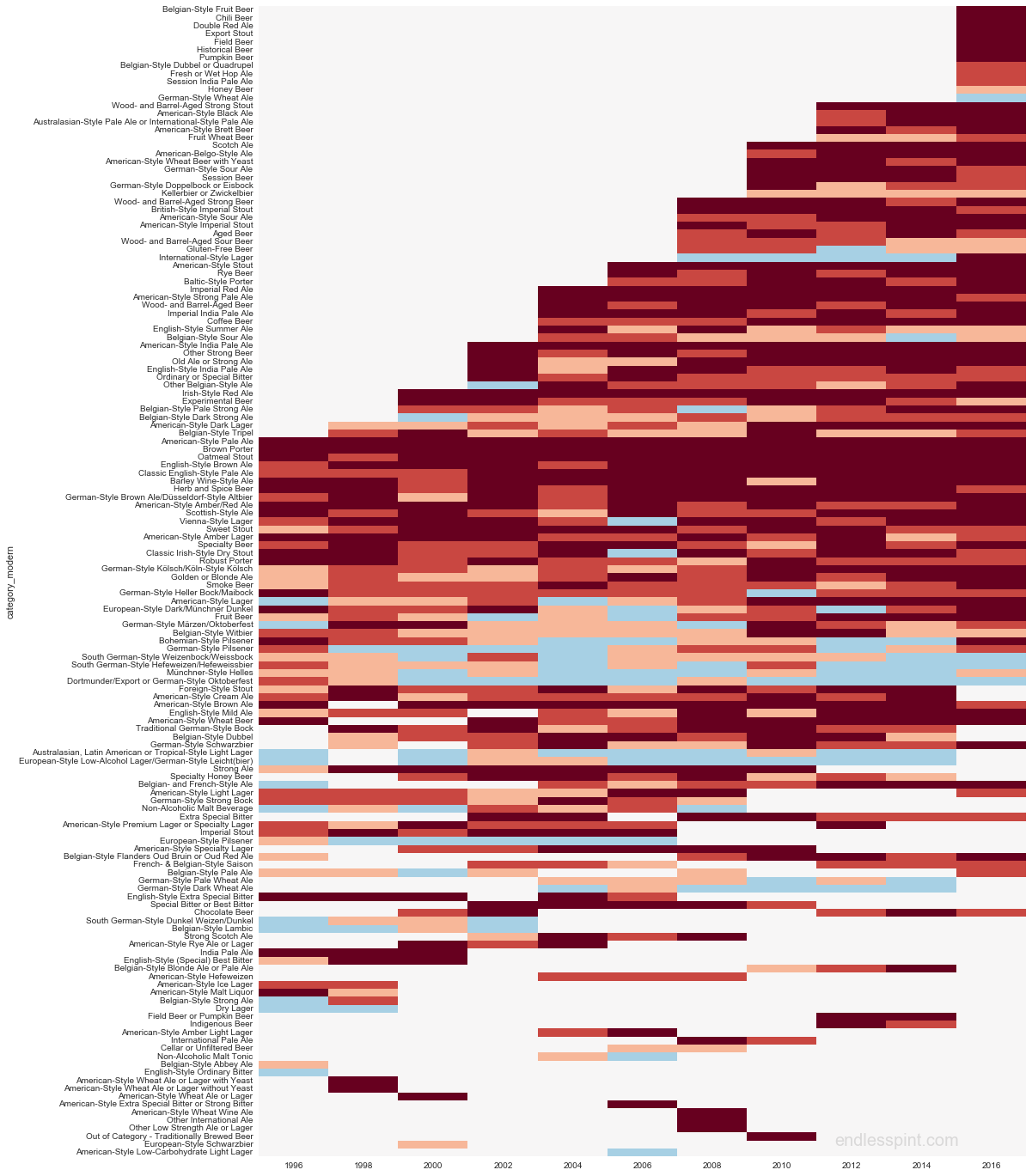
Heatmap Redux - below is a remix of the same data, this time with the categories sorted:
- Category present in 2016
- Fewest number of competitions (1) to most (11), within 2016.
- Larger number of US wins above lower counts.
- For non-2016 competed categories the number of categories are sorted from largest (10) to smallest (1).
The intention was to create a rhombus-like shape, slanting from top-right to bottom-left. Especially for the top half (this is not an optimized algorithm) it should now be clearer than before to identify the most recently added categories, spot the consistent categories in the middle, and still get a general idea of US dominance: a lot of orange/red-ish hues.
Why Dominant
I concluded the earlier piece on US number domination by mentioning that a result well beyond the range of expectations may prompt us for or provide some insight into underlying (craft)beer conditions. While still looking into this, one working hypothesis for the new domination is that the ‘Mericans are mostly competing against themselves (70% of all entrants, no duh!) in the sense that there may be categories without any non-US representation. The WBC does not make the breakdown of entrants by category readily available so we’ll have to go about this in a roundabout way.
The WBC does provide a list of participating breweries for the competition as a whole. We are not told which categories the breweries compete in or what beers they compete with. Helpful, but not quite. My first thought was, “I don’t wanna investigate all those stoopid breweries. There’s gotta be another way.” After whining like a child I decided to run some searches on Beeradvocate for two example categories, both added for 2016, Chili Beer and Pumpkin Beer, and see if I could turn up anything interesting. After some poking and prodding I came up with the following (13 May 2016):
| Style | Beer Count | Total Breweries | Percent US |
|---|---|---|---|
| Chili | 325 beers | 276 | 87%4 |
| Pumpkin | 1,263 beers | 978 | 95%5 |
This was meant as exploratory and to spur further consideration, it is not a full explanation but hints at a way of quantifying the beer style profiles by country moving forward. This is something I will definitely be tackling in the future, but not right away. For the next couple of posts I will be going deeper into individual styles, going off-topic, and doing a quick reflection of what’s been covered so far.
Notes
1 There was an expected 288 medals, 3 each for the 96 categories, but no Gold was given out for Fresh or Wet Hop Ale. ↩
2 For the sake of this piece “sweeping” a category means winning 3 medals. No $hit Sherlock? Well, how about the intances when less than 3 medals were given out (see Fresh or Wet Hop Ale mentioned in the previous note)? This is to say that the US numbers might be even a little more dominant if we went digging into the weeds. At the same time this may cut both ways: is it fair to say the US was shut out of a 2 or 1 medal granting category? ↩
3 Table of US Medal Percentage
| medals | 3 | 2 | 1 | 0 |
|---|---|---|---|---|
| 1996 | 0.305 | 0.254 | 0.254 | 0.186 |
| 1998 | 0.397 | 0.310 | 0.224 | 0.069 |
| 2000 | 0.328 | 0.344 | 0.172 | 0.156 |
| 2002 | 0.429 | 0.257 | 0.214 | 0.100 |
| 2004 | 0.383 | 0.296 | 0.198 | 0.123 |
| 2006 | 0.376 | 0.259 | 0.224 | 0.141 |
| 2008 | 0.440 | 0.308 | 0.154 | 0.099 |
| 2010 | 0.544 | 0.233 | 0.156 | 0.067 |
| 2012 | 0.516 | 0.274 | 0.095 | 0.116 |
| 2014 | 0.511 | 0.245 | 0.128 | 0.117 |
| 2016 | 0.573 | 0.292 | 0.094 | 0.042 |
↩
4 241 of 276 breweries; I did NOT want to ping BA for every beer. ↩
5 38 or 40 sampled breweries; I DEFINITELY didn’t want to ping BA for nearly 1,000 breweries. ↩
Notes II
Special thanks to Mario and Luigi for this post’s color scheme.